My business partner – whilst having a reasonable idea that Haron and I live a somewhat unconventional lifestyle – is himself entirely vanilla. As a result, he often fires over notes that inadvertently amuse.
Take one at the weekend, in connection with a presentation on which we’ve jointly been working, in which he commented:
We need fonts which indicate –
– Humor
– Sarcasm
– Stress
– Disappointment
– Embarrassment
– Shame
Now, I have not a clue as to which part of our presentation will involve us expressing our ‘disappointment’ in members of the audience, or causing them to feel ’embarrassment’ at their misconduct, followed later by a sense of ‘shame’. I rather look forward to finding out what he has in store.
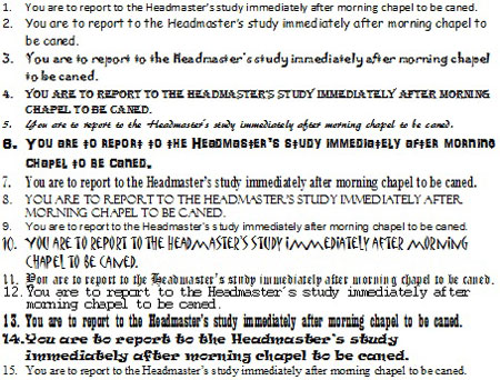
Still, the issue of aligning the content of a document with its presentation is a topic with which I wrestle regularly in my professional life – yet it had never occurred to me to consider it in a kinky context. So, how about the following selection of typefaces for the same message in a note to a girl:

I wonder which is the most – and least – appropriate font for setting a suitable tone?
Not nber 10 – it looks likenthe kind of note you get in a slasher film. It should say ‘i am watching you. Soon you will be dead!’
Number 5 – perfect excuse for not turning up at all. Unless of course you had a particular fetish for being caned by a dolls house doll !
Number 3 is *definitely* the most appropriate.
Man I love geeking out on fonts. I think Garamond is suitably polite and distant for the occasion. Then again, can anything match the gravity of Curlz?
Apparently they don’t love it when you put essays in that really pretty italic one. I learnt that the hard way.
I vote number 4. It’s looks like it’s been stamped on. Maybe the Head Master has a stamp that he slams down on little note cards. Bam. Done.
Surely the last clause shouldn’t be included, leaving the poor girl with the vain hope that she won’t be caned? Obviously, the note should be hand-written on good paper with an expensive fountain-pen.
Pingback: chross.blogt.ch - Chross Guide To The Spanking Internet
Number 13. It’s so old-fashioned and formal.
I like 12 -its got the old school typewriter look – I think the secretary typed it up adding to the embarrassment
IMO 8 & 10 are inappropriate.
15 OTOH, looks as though it mght have been typed out by the school secretary – you can’t beat good old-fashioned Times New Roman.
None of them are right for a handwritten note though
I do find it amusing that there’s absolutely no agreement whatsoever on which is the best font! We’ve had votes for 3, 4, 5, 10, 12, 13 and 15 – with none getting more than one vote! Perhaps that suggests that the font doesn’t actually really matter?
Abel — it seems we do have some agreement on what *not* to use! 8, 10, and I would add 14 seem like they would lack sufficient mood-setting quality…
But allow me to add another single vote to the pot for number 11 as my favorite 😀
Pingback: With colleagues like this… | The Spanking Writers